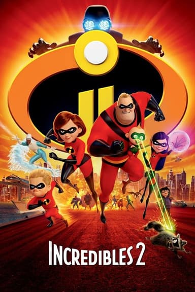
“Another criticism I forgot to mention is how incredibly bright and colorful Incredibles 2 (2018) looks that it’s a major issue. While the animation in the sequel is better than the first movie in terms of character models, movements and actions sequences but unfortunately the bright colors ruins the vibe that the Incredibles had in the first film. Yes the first movie’s colors looked kinda lifeless and a bit bland but it perfectly fit the tone of the movie really well considering how witness dark the and mature theme the movie but still had some comedy. Incredibles 2 feels like it’s just trying to showcase how bright and colorful it can really be but it’s honestly quite of a distraction that it kinda ruins the vibe the first movie had and it honestly doesn’t fit the Incredibles too well IMO, I really miss the old coloring, another quick criticism I forgot to mention is how Incredibles 2 takes NO risks at all and just straight up copies the first film and tones down the dark tone that the first movie had trying to make it a but more family friendly.”
@MiguelArtwork16